Intro Showcase View

An android library to highlight different features of the app built using Jetpack Compose.
The library is inspired by the TapTargetView that is useful for legacy views.
Configuration
Available on Maven Central.
Add the dependency
implementation 'com.canopas.intro-showcase-view:introshowcaseview:<latest-version>'
How to use ?
@Composable
fun ShowcaseSample() {
var showAppIntro by remember {
mutableStateOf(true)
}
IntroShowcase(
showIntroShowCase = showAppIntro,
dismissOnClickOutside = false,
onShowCaseCompleted = {
//App Intro finished!!
showAppIntro = false
},
) {
FloatingActionButton(
onClick = {},
modifier = Modifier.introShowCaseTarget(
index = 0,
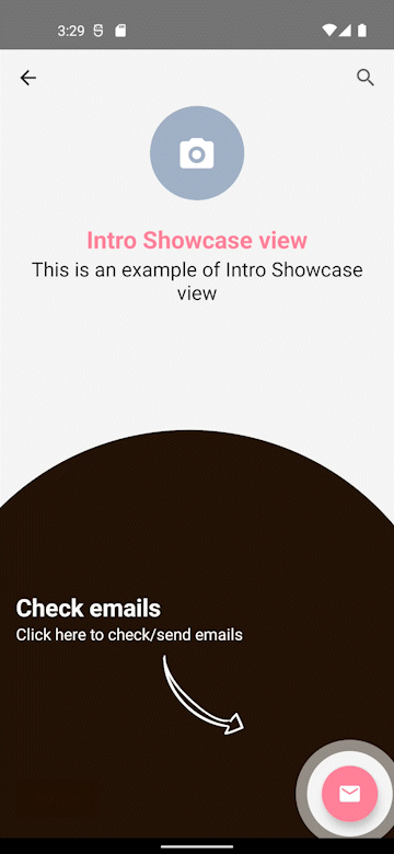
style = ShowcaseStyle.Default.copy(
backgroundColor = Color(0xFF1C0A00), // specify color of background
backgroundAlpha = 0.98f, // specify transparency of background
targetCircleColor = Color.White // specify color of target circle
),
// specify the content to show to introduce app feature
content = {
Column {
Text(
text = "Check emails",
color = Color.White,
fontSize = 24.sp,
fontWeight = FontWeight.Bold
)
Text(
text = "Click here to check/send emails",
color = Color.White,
fontSize = 16.sp
)
Spacer(modifier = Modifier.height(10.dp))
Icon(
painterResource(id = R.drawable.right_arrow),
contentDescription = null,
modifier = Modifier
.size(80.dp)
.align(Alignment.End),
tint = Color.White
)
}
}
),
backgroundColor = ThemeColor,
contentColor = Color.White,
elevation = FloatingActionButtonDefaults.elevation(6.dp)
) {
Icon(
Icons.Filled.Email,
contentDescription = "Email"
)
}
}
}
Demo
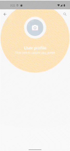
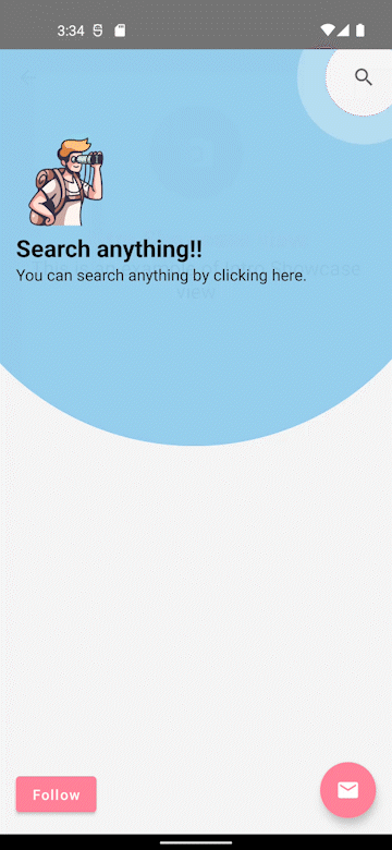
Sample app demonstrates how simple the usage of the library actually is.
Interested in library implementation?
Checkout the Article
Bugs and Feedback
For bugs, questions and discussions please use the Github Issues.
Credits
Intro showcaseview is owned and maintained by the Canopas team. You can follow them on X at @canopassoftware for project updates and releases.